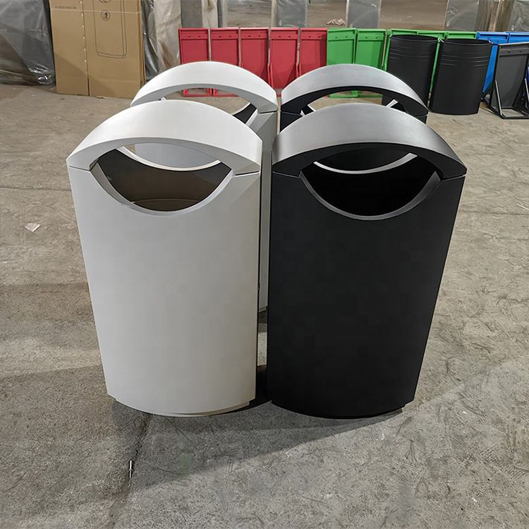
Share your requirements and target market. We’ll suggest the right configuration, sampling path, and production plan.
During business hours, We can usually provide a preliminary quote within two hours.
: workflow-based setups to improve efficiency and keep corridors tidy
: easier bag changes and maintenance, built for daily facility use
: 1–3 stream options with clear icon/label systems to reduce contamination
: materials, finishes, branding & packaging locked for consistent reorders
Your info is used only for quoting and communication.
Recycling Station Signage Design for Commercial Buildings: Words, Icons and Color Coding
Most recycling station signage fails because it expects busy people to decode waste policy while holding trash. This guide shows how words, icons, colors, and bin placement make sorting faster, cleaner, and less painful.
A coffee cup tells the truth.
Not the sustainability report. Not the glossy lobby rendering. The coffee cup — half full, sleeve still on, lid snapped tight — tells you whether your recycling signage design actually works when a distracted tenant is walking between a meeting room and an elevator.
Usually, it doesn’t.
I’ve seen buildings spend real money on bins that look expensive, then slap “Recycling” above one hole and “Waste” above another like that’s enough. It isn’t. Here’s the ugly truth: most recycling station signage is designed by people who already know the sorting rules. The user doesn’t. The user has a salad bowl, a napkin, a plastic fork, and six seconds.
So what happens?
They guess.
And guessing is contamination with better manners.
The EPA’s commercial building waste guide says recycling, composting, and trash stations work better when signs use clear pictures and show what belongs in each bin, not just broad labels like “Recycle” or “Landfill.” That guidance is plain, almost boring — which is why it’s useful. See the EPA’s own guidance on managing and reducing wastes in commercial buildings.
But plenty of buildings ignore it.
Why? Because signage gets treated like decoration. A vinyl sticker. A brand touchpoint. A nice little sustainability accessory.
Wrong category. Wrong mindset.
Recycling signage is a control system.
Start with the trash, not the sign
I frankly believe the biggest mistake happens before anyone chooses a color, font, or icon set.
The team starts with design.
Bad move.
Start with the waste stream. Walk the lobby, pantry, mailroom, restroom corridor, elevator bay, conference floor, loading dock, and back-of-house service route. Open the bins. Yes, actually open them. If that makes people uncomfortable, good — because the bin audit is where the fiction ends.
You’ll see the real pattern fast:
Coffee cups in paper recycling
Liquids dumped into bottle bins
Plastic bags wrapped around “clean” recyclables
Food containers shoved into landfill because nobody trusts compost
Napkins everywhere
Cardboard folded badly, or not folded at all
Beautiful signs nobody reads
It’s messy. Normal.
In New York City, commercial recycling rules don’t just say “please recycle.” Businesses are told to separate recyclable material, provide labeled containers, notify occupants, and post signs where trash and recyclables are collected or stored. The official DSNY language is dry, but the design implication is sharp: signage has to follow the waste path, not just the public-facing bin. Here’s the city’s commercial recycling notice: NYC commercial recycling notice.
That means your recycling station signage should match the hauler contract, local code, tenant behavior, and janitorial workflow.
Not your mood board.
The words: stop saying “recyclables” like people care
“Mixed recycling” sounds professional.
It also sounds like homework.
A person standing at a bin does not ask, “Is this material theoretically recoverable under modern MRF conditions?” They ask, “Where does this bottle go?”
Tiny copy choices carry the whole program.
Use object-level words. Say the thing. Say it bluntly.
Weak wording
Better wording
Why it works
Mixed Recycling
Bottles, Cans, Clean Paper
Names real items
Compost
Food Scraps, Napkins, Tea Bags
Removes guesswork
Landfill
Wrappers, Foam, Dirty Packaging
Tells people what not to wish-cycle
No Trash
No Food, No Liquids, No Plastic Bags
Blocks common contamination
Paper Only
Office Paper, Mail, Flattened Cardboard
Fits office behavior
Short wins.
But not dumb short. There’s a difference.
“Recycle Here” is short and useless. “Empty Bottles + Cans” is short and useful. One is branding. The other is instruction.
The Recycling Partnership’s 2023 report talks about recycling behavior through access, knowledge, and engagement. I like that framework because it cuts through the usual corporate fluff: if people don’t know what goes where, the bin might as well be a guessing booth. Their report is here: The Recycling Partnership 2023 Knowledge Report.
And yes, I know some designers hate “ugly” instructional wording.
Let them hate it.
Clean streams beat elegant confusion.
Icons: the recycling loop is doing too much work
The chasing-arrows symbol is not a sorting system.
It’s a symbol. A famous one, sure. But still only a symbol.
I’ve watched people throw greasy pizza boxes into recycling under a giant recycling icon because the sign gave them no better instruction. The user wasn’t stupid. The sign was lazy.
Use icons that look like the actual waste:
Bottle
Can
Sheet paper
Cardboard box
Apple core
Napkin
Coffee cup
Plastic bag
Foam cup
Battery
Light bulb
Food tray
And don’t stop at “accepted.”
Show “not accepted.”
A red X over a plastic bag is worth more than a paragraph about film plastic contamination. A crossed-out coffee cup does more work than “Please dispose of non-recyclable materials properly.” That sentence sounds like a policy memo written by a committee that has never stood near a lunchroom bin.
Pictures work. The research direction backs it up too. A 2023 study on waste classification behavior found that image/icon-based signage helped sorting accuracy compared with text-only cues. The paper is here: 2023 waste classification signage study.
Still, icons aren’t magic.
If your icon looks like a generic cup, users will ask: hot cup? cold cup? compostable cup? plastic cup? paper cup? lid on? lid off?
Welcome to the bin wars.
Color coding helps — until it lies
Blue means recycling.
Except when it doesn’t.
Green means compost.
Except when it’s paper in one city, organics in another, or just “eco-looking” nonsense on a decorative receptacle bought because it matched the floor tile.
Color coding is useful only when it stays consistent across the whole property. Lobby. Pantry. Tenant floor. Waste room. Loading dock. Same logic. Same color family. Same stream name. Same icon behavior.
California’s SB 1383 system gives a clean reference: green for food waste, yard waste, and organic material; blue for traditional recyclables like bottles, cans, plastic, clean paper, and cardboard; gray for waste that is not organic or recyclable. CalRecycle explains that container model here: CalRecycle collection systems, container colors, and labeling.
But don’t copy blindly.
Local rules matter. Hauler acceptance matters. Compostable packaging rules matter. Some “compostable” cups are only compostable in facilities your building may not use. Some paper cups have coatings. Some plastic items have resin codes but still don’t belong in the local stream.
Annoying? Yes.
Real? Also yes.
CalRecycle’s toolkit includes customizable recycling, organics, and trash signs, which tells you the quiet part out loud: even with statewide color logic, signs still need item-level instructions. See the CalRecycle commercial organics recycling toolkit.
Waste stream
Common color
Best sign wording
Icon priority
Design warning
Recycling
Blue
Bottles, Cans, Clean Paper
Bottles, cans, paper, cardboard
Add “No Food / No Liquids”
Compost / Organics
Green
Food Scraps, Napkins, Compostables
Apple core, napkin, food tray
Only use if hauler accepts compostables
Landfill
Black / Gray
Wrappers, Foam, Dirty Packaging
Wrapper, foam cup, broken item
Avoid “General Waste” alone
Paper
Blue / White
Office Paper, Mail, Cardboard
Sheet paper, envelope, box
Useful in offices, copy rooms
Special waste
Red / Yellow / Custom
Batteries, E-Waste, Bulbs
Battery, phone, bulb
Needs separate handling rules
A sign can’t rescue a bad station layout.
That part matters.
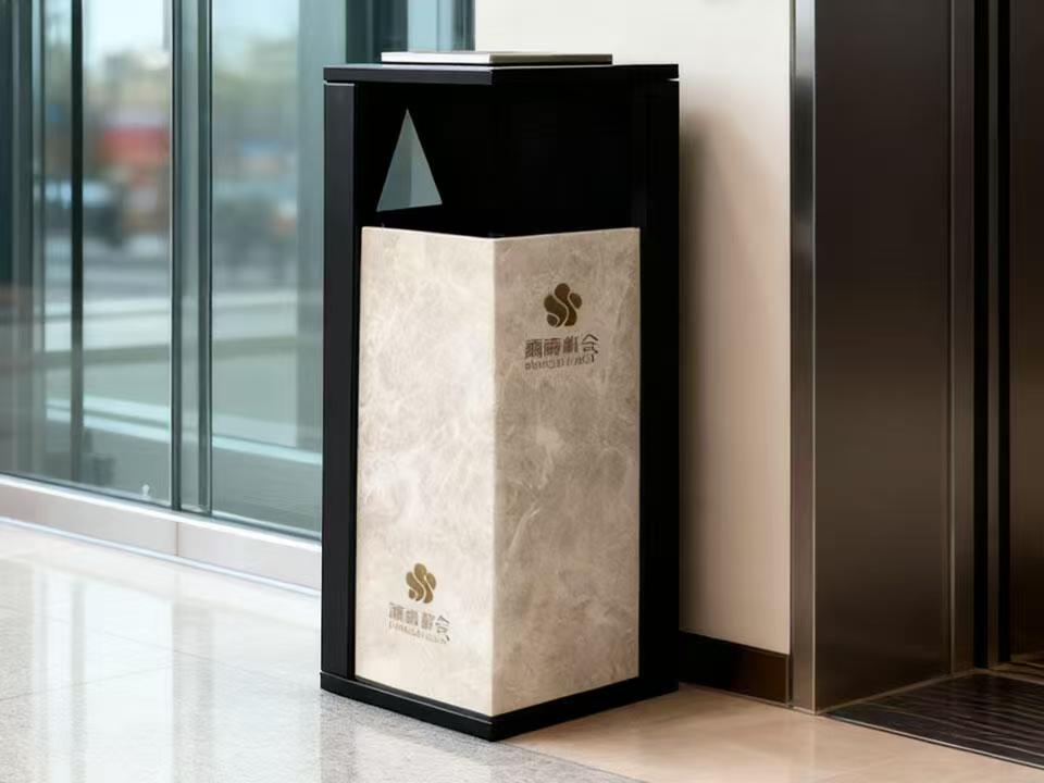
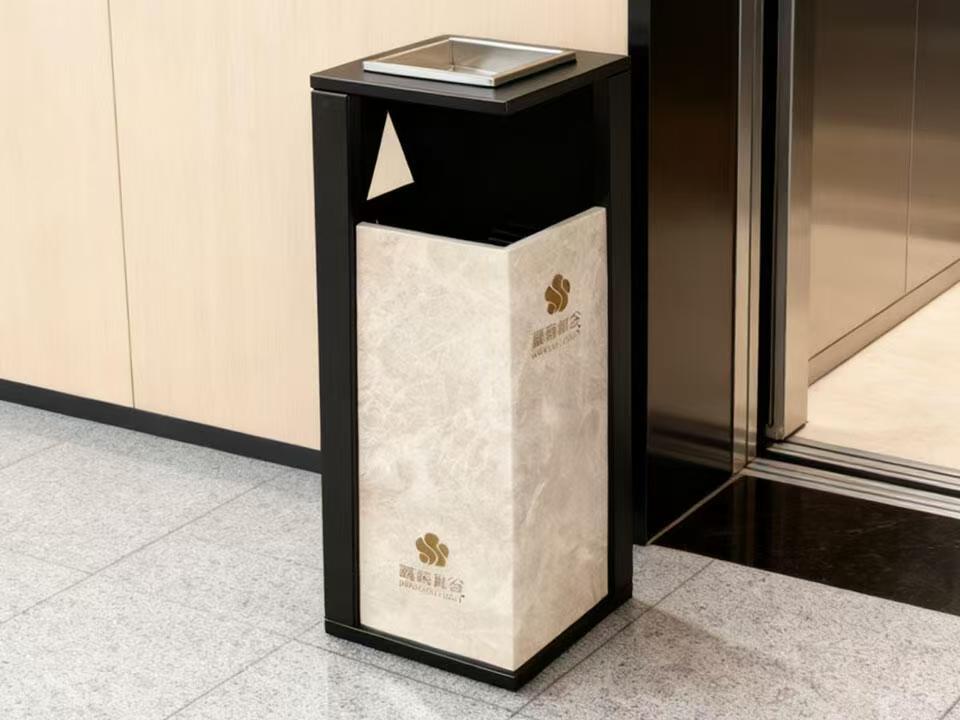
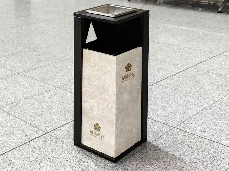
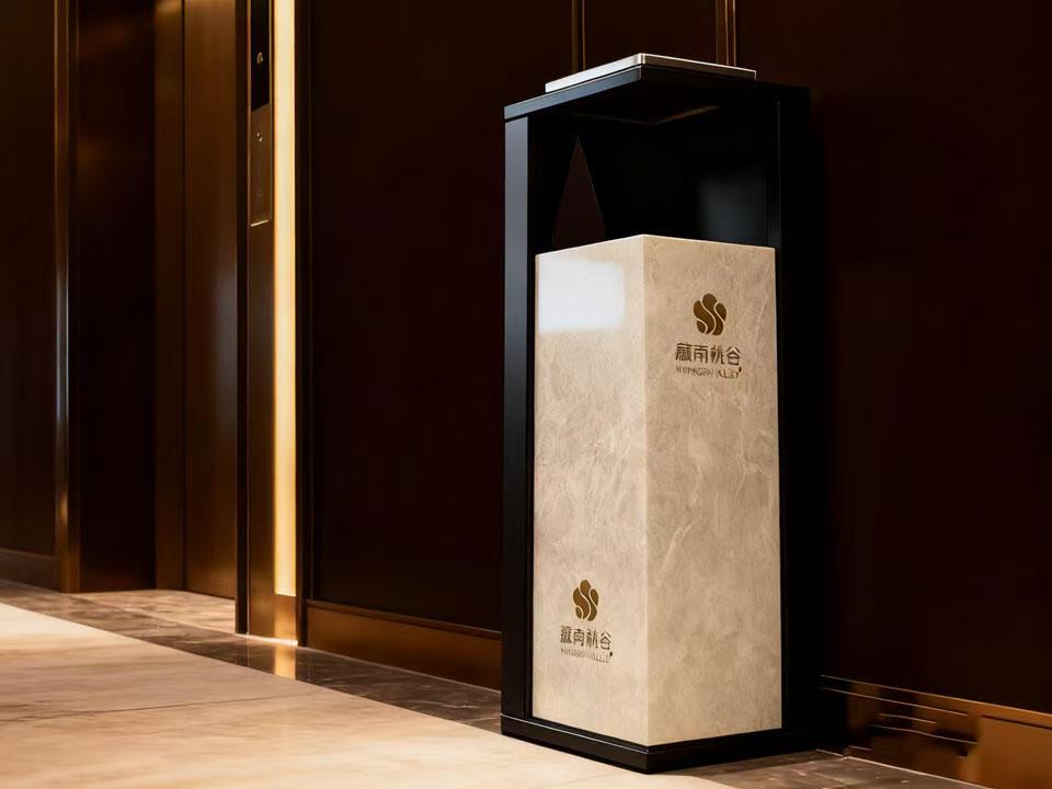
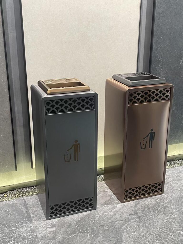
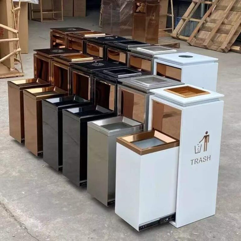
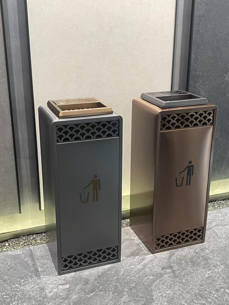
A stainless steel lobby litter bin can look sharp in a commercial lobby, but if the label says only “Waste,” you’ve made the user guess with nicer hardware. A marble-pattern lobby trash receptacle can fit a hotel, office tower, or retail entrance beautifully — but the sorting language still needs to be visible, plain, and close to the opening.
Pretty bins fail quietly.
Put the sign where the hand moves
Ever see a recycling poster mounted six feet above the bin?
Looks official. Performs badly.
People don’t study wall posters while holding wet trash. They look at the hole. The lid. The slot. The flap. The opening shape. That is where the decision happens.
So I use three sign zones:
Approach zone: what stream is available from 6–10 feet away.
Decision zone: what goes into each opening.
Touch zone: the final label near the lid, slot, or flap.
That third zone is the money zone.
If you’re using a motion sensor trash can for high-traffic areas, watch the label placement carefully. A lid that opens automatically can accidentally hide the message at the exact moment the person needs it. Put the stream name and top accepted items where the eyes land before the sensor triggers.
And hotels? Different beast.
Guests don’t know your waste program. They don’t know your hauler. They don’t know if the “eco” cup from breakfast is compostable, recyclable, or landfill. They’re in a robe, or late for checkout, or walking through the lobby with luggage.
Back-of-house needs its own logic too. A custom linen amenity cart for hotels can support housekeeping workflows, amenity movement, and cleaner separation behind the scenes, but guest-facing recycling station signage still has to be idiot-proof. I don’t mean the guest is an idiot. I mean the system has to survive normal human inattention.
That’s the standard.
Contamination is not a “people are careless” problem
People are careless.
But that’s not the whole story.
Contamination also happens because the building asked for it. Vague labels. Inconsistent bins. No pictures. Bad lid geometry. Hidden signs. No back-of-house training. A janitorial team that has to fix everyone else’s bad decisions after midnight.
The EPA’s 2024 recycling infrastructure assessment points to contamination, low collection rates, weak end markets, profitability problems, and poor decision-making information as major issues in the U.S. recycling system. That’s not just a national infrastructure issue. It shows up at the bin level inside commercial buildings. Read the EPA’s full assessment here: An Assessment of the U.S. Recycling System.
Here’s my unpopular take: recycling signage is often blamed last because it was designed first.
Everyone assumes the sticker is done. Then contamination shows up. Then operations blames tenants. Tenants blame unclear rules. Janitorial teams roll their eyes. Management orders another awareness email nobody reads.
No thanks.
Fix the station.
Building area
Main user
Common mistake
Signage fix
Lobby
Visitors, tenants
Coffee cups, wrappers in recycling
Use “empty bottles/cans only” icons
Pantry
Employees
Food-contaminated packaging
Add “No food or liquid” near recycling
Conference rooms
Guests, staff
Mixed paper, cups, catering waste
Use temporary event signage
Loading dock
Janitorial team
Bag mixing, cardboard contamination
Use large bilingual sorting posters
Restrooms
Visitors
Paper towels in recycling
Usually avoid recycling unless stream is managed
Hotel corridors
Guests
Bottles mixed with food waste
Use paired bins and simple pictograms
My working formula for recycling station signage
I keep coming back to this:
Stream name + real items + rejected items + local note
That’s it.
Not a manifesto. Not a sustainability slogan. Not “Join us in protecting tomorrow through responsible material stewardship.” Please don’t.
Use something like this:
RECYCLING Bottles, cans, clean paper, flattened cardboard No food. No liquids. No plastic bags. Empty items first.
Boring? Maybe.
Effective? Usually.
For a compost stream:
FOOD SCRAPS Food, napkins, tea bags No plastic. No glass. No metal. Compostable packaging only if accepted here.
That last line matters because “compostable” has become a trap word. Operators know this. Designers sometimes don’t.
FAQ
What is recycling signage design?
Recycling signage design is the planning of words, icons, colors, labels, and bin placement that tells people exactly how to sort waste at a disposal point. In commercial buildings, it must match local rules, hauler requirements, user behavior, and the actual waste materials generated on site.
In plain English: it’s the difference between a user guessing and a user knowing. Good recycling station signage shows real items, uses consistent colors, flags rejected materials, and appears close enough to the bin opening that people see it before they toss.
How do you design recycling signage for commercial buildings?
To design recycling signage for commercial buildings, audit the waste stream first, confirm local and hauler rules, then create signs with clear stream names, item-level examples, icons, rejected-material warnings, and consistent color coding across every bin location. The sign should answer the disposal question in seconds.
Don’t begin with the graphic template. Begin with the mistakes. If people keep putting coffee cups in recycling, the sign needs coffee cup guidance. If plastic bags keep showing up, show the bag with a red X. Specific beats polite.
What color should recycling bin labels be?
Recycling bin labels are commonly blue for recyclables, green for compost or organics, and black or gray for landfill waste, but the right color depends on local rules and the building’s collection system. Color should reinforce sorting instructions, not replace words, icons, or accepted-item examples.
The trick is consistency. If blue means bottles and cans in the lobby, it should not mean paper-only upstairs. Once users notice the system changing by floor, they stop trusting it — and they start guessing again.
Are icons better than words on recycling signs?
Icons are often better than words for fast sorting decisions, especially in high-traffic commercial buildings, but they work best when paired with short labels. A bottle icon plus “empty bottles” is clearer than a recycling symbol alone, especially for visitors, hotel guests, and multilingual users.
Use icons for the actual trash people hold: cans, bottles, paper, cardboard, food scraps, napkins, wrappers, plastic bags, and coffee cups. Then show rejected items too. A red X can save more sorting errors than another paragraph of friendly instruction.
What should a recycling station sign include?
A recycling station sign should include the waste stream name, accepted items, rejected items, matching icons, consistent color coding, and any local sorting rule that changes what users should do. In commercial buildings, it should also match the bin opening, lid design, janitorial process, and hauler collection method.
A simple version works: “Recycling: empty bottles, cans, clean paper. No food, liquids, or plastic bags.” That’s not fancy copy. It’s functional copy. And functional copy is what keeps a recycling stream from becoming expensive trash.
Why does recycling signage fail in office buildings and hotels?
Recycling signage fails in office buildings and hotels when it uses vague language, abstract symbols, inconsistent colors, poor placement, or generic rules that don’t match the local waste program. The result is predictable: contamination, tenant confusion, guest mistakes, and extra work for facility teams.
Office users rush. Hotel guests don’t know the property’s sorting rules. Janitorial teams inherit the mess. That’s why the sign has to do more than look official — it has to tell the truth fast, right where the hand moves.
Ready to fix the bin before blaming the user? Start with the waste audit, then match the words, icons, colors, lid openings, and placement to the actual behavior inside the building. That’s where recycling signage design stops being a sticker and starts working like part of the facility system.
I preserved the same source URLs and internal links while making the draft more uneven, opinionated, and field-level.