Share your requirements and target market. We’ll suggest the right configuration, sampling path, and production plan.
During business hours, We can usually provide a preliminary quote within two hours.
: workflow-based setups to improve efficiency and keep corridors tidy
: easier bag changes and maintenance, built for daily facility use
: 1–3 stream options with clear icon/label systems to reduce contamination
: materials, finishes, branding & packaging locked for consistent reorders
Your info is used only for quoting and communication.
Should Hotel Trash Bin Colors Match Interior Design Standards?
A blunt, procurement-minded look at hotel trash bin colors, interior design standards, recycling labels, guestroom bins, lobby receptacles, and the hidden operational cost of making waste bins “too pretty to work.”
Table of Contents
The Real Answer: Yes, But Design Comes Second
Match the room.
But if a hotel trash bin blends so well into the lobby that guests cannot find it, cannot read the waste stream, or dump iced coffee into the recycling side because the label was sacrificed for a “cleaner aesthetic,” the designer has not created elegance; they have created operational drag with a nicer finish.
So what are we really matching?
Hotel trash bin colors should support interior design standards, not obey them blindly. That is the hard truth. I would rather see a matte charcoal bin with a loud, legible recycling label than a perfectly coordinated champagne-gold receptacle that contaminates half the stream before breakfast service ends.
The bin is not furniture. It behaves like infrastructure.
That distinction matters because hotel waste is no longer a back-of-house issue. UNEP’s 2024 Food Waste Index release reported 1.05 billion tonnes of food waste in 2022, with food service responsible for 28% of the total; hotels, banquet rooms, breakfast bars, cafés, and event spaces sit directly inside that food-service problem, whether the brand deck admits it or not. UNEP’s 2024 Food Waste Index release makes the scale impossible to wave away.
And that is why hotel waste bins deserve the same seriousness as flooring, lighting, signage, and door hardware.
The Color Mistake Hotels Keep Repeating
Most hotel teams ask the wrong question: “Will this bin match the interior?”
The better question is uglier, and more useful: “Will this bin still guide the right behavior when a tired guest is carrying a suitcase, a coffee, a conference badge, and zero patience?”
That is where decorative trash bins for hotels often fail. They look expensive in a rendering. Then reality arrives: fingerprints, liner creep, unclear openings, dim hallway light, multilingual guests, distracted banquet traffic, and the quiet embarrassment of recyclables sitting in landfill waste because the bin was designed like a sculpture instead of a decision point.
I’m not anti-design. I’m anti-theater.
A hospitality trash can needs three color layers:
Body color: the architectural finish that can coordinate with the interior.
Stream signal color: the color cue that tells users what belongs where.
Service cue color: the internal or back-of-house cue that helps staff reset, clean, and audit the bin fast.
Those layers should not be treated as the same thing.
A lobby bin can have a black, bronze, stainless, white, or wood-look body. Fine. But the stream cue still needs contrast. Blue for recycling. Green for organics where applicable. Gray or black for landfill. Not necessarily a full-colored box, but a visible band, decal, lid insert, aperture panel, or sign frame.
Facility Project Solutions’ own product architecture points in this direction: their OEM/private-label program emphasizes commercial trash bins and recycling sorting systems configured around brand standards, signage rules, and deployment needs, not just appearance. That is the right framing for multi-property hotel programs.
Color Compliance Is Not a Mood Board
Here is where designers sometimes get defensive.
Color coding is not always optional. In California, for example, SB 1383 rules require businesses to provide collection containers for organic waste and recyclables in customer disposal areas except restrooms, and internal containers must use the required color or labeling. Existing compliant containers may stay until they stop functioning or until January 1, 2036, whichever comes first. CalRecycle’s statewide organic waste collection rules spell this out plainly.
CalRecycle’s standardized system defines green containers for food waste, yard waste, green waste, and other organic materials; blue containers for traditional recyclables such as bottles, cans, plastic, and some clean paper/cardboard; and gray containers for material that is not organic or recyclable. CalRecycle’s container color guidance is a useful warning for hotels operating across multiple jurisdictions.
That does not mean every hotel lobby needs three cartoon-colored bins screaming at guests.
It means commercial waste bin color coding has to survive the interior concept. Use colored lids, top plates, bands, icons, restricted openings, or label panels. Keep the body finish aligned with the property. But do not erase the waste signal.
Bad sorting is expensive. Quietly expensive. The kind nobody notices until the hauler rejects a load, the sustainability report looks suspiciously vague, or housekeeping starts “fixing” the design with handwritten labels.
Guestroom Bins Are Different From Lobby Bins
A guestroom bin can be subtle. A lobby bin cannot afford to be invisible.
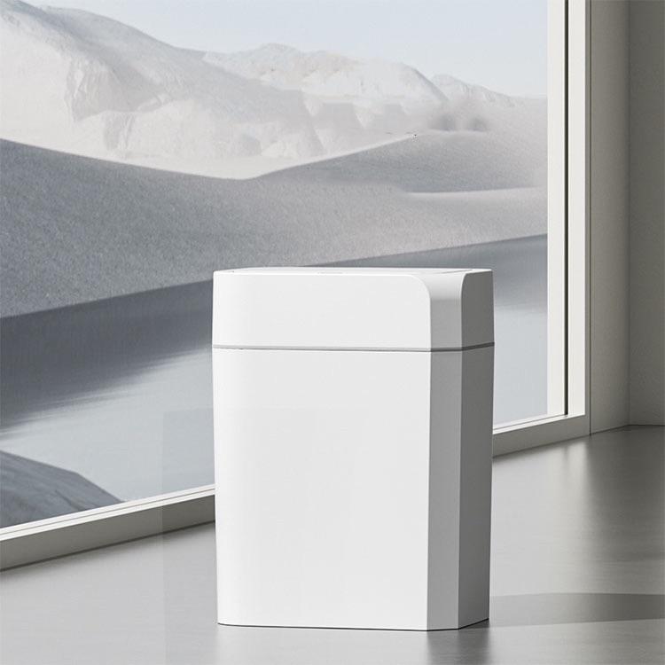
That is the split most hotel brands miss. Hotel room garbage cans sit in controlled, low-volume spaces. Guests use them privately. Housekeeping empties them on a route. The design standard can lean softer: black, warm gray, brushed metal, off-white, wood-look, or a matched powder coat.
But even in guestrooms, two-bin setups need obvious differentiation. I have no patience for twin baskets that depend on a tiny debossed recycling symbol near the floor. That is not sustainable design. That is symbolic design.
For guestrooms, the better standard is:
Neutral exterior finish matching furniture, millwork, or bathroom accessories.
Clear stream label on the rim, lid, or inner face.
Different aperture or liner color where possible.
Easy-clean material, because guests will put wet waste where you hoped they would not.
For lobbies and dining zones, the standard tightens. The luxury open-top lobby trash can for hotel interiors is a good example of the tension: it is built to blend into upscale reception areas, corridors, and business centers, but the useful part is not only the polish; it is the open-top access, concealed liner logic, and quick wipe-down service profile.
Pretty is not enough. Pretty has to empty cleanly.
The Hotel Trash Bin Color Decision Table
Hotel Zone
Best Color Strategy
Why It Works
What I Would Reject
Guestroom
Neutral body with clear rim or liner cue
Keeps the room calm while still guiding disposal
Two identical bins with tiny icons
Lobby
Interior-matched body with high-contrast stream signage
Preserves brand look without hiding function
Fully camouflaged bins near seating or elevators
Breakfast / Café
Stronger color cue on lids, apertures, or panels
Food, cups, napkins, and bottles need fast sorting
Decorative bins with no organics/recycling distinction
Conference / Banquet
Modular multi-stream system with large labels
High-volume events produce mixed waste fast
Single “trash only” bins at ballroom exits
Back-of-House
Function-first color coding
Staff speed and compliance matter more than aesthetics
Designer finishes that slow cleaning
Outdoor Entry
Durable dark body with visible labels and weather-resistant contrast
Handles traffic, smoking waste, rain, and abuse
Light finishes that stain quickly
Two-Stream, Three-Stream, Or One Beautiful Mistake?
Hotels love one-bin simplicity because it photographs well.
Guests do not live in photography. They live in motion.
In a lobby, a 2-stream waste sorting bin for hotels makes sense when the property primarily needs landfill and recyclables separated with bold labels, restricted openings, removable liners, and a service door. That is the minimum serious setup for many public hotel spaces.
A custom 3-stream recycling bin for hospitality spaces becomes more defensible in dining areas, meeting floors, cafés, and event zones where bottles/cans, paper, landfill, and organics may need separation; the key is not the number three, but the combination of site-specific graphics, optional color cues, and restrictive openings.
One bin still has a place. Restrooms. Small guestrooms. Controlled staff-only points. Some corridors. But a single beautiful bin in a lobby with food, bottles, paper, and guest confusion is usually just a contamination machine wearing a nice finish.
The Accessibility Angle Nobody Puts In The Rendering
Trash bin color is not the only standard. Placement matters too.
The ADA regulatory framework for public accommodations and commercial facilities relies on the 2010 ADA Standards for Accessible Design; those standards address circulation paths, protruding objects, and operable parts, which can become relevant when bins are placed in corridors, elevator lobbies, restroom approaches, or tight public routes. The eCFR text on ADA accessibility guidelines notes that protruding objects on circulation paths must comply with Section 307.
Translation for hotel teams: a bin that matches the wall too well may also become harder to detect, especially for low-vision guests. A bin that sticks into the path is not “convenient placement.” It is a complaint waiting for a busy weekend.
So yes, match the interior. But test the bin in the actual circulation route. Test it under warm lobby lighting. Test it with glare from stone flooring. Test it when a luggage cart passes. Test it when housekeeping opens the door panel.
Design that ignores movement is not design. It is styling.
The Sustainability Claim Needs A Bin System Behind It
Hotels have become fluent in sustainability language. Some of it is real. Some of it is wallpaper.
The waste station is where the claim gets exposed.
Reuters reported in November 2024 that more than 50 countries signed a UN sustainable tourism declaration, and the article cited tourism as 3% of global GDP and 8.8% of greenhouse emissions. Reuters’ coverage of the sustainable tourism declaration shows why hotel operations are being pulled deeper into climate reporting and operational accountability.
A hotel cannot credibly talk about waste reduction if the guest-facing bins are decorative riddles.
This is where the Facility Project Solutions sustainability approach for commercial trash bins and recycling stations fits the actual problem: repeatable bin families, consistent labels, multilingual signage options, right-sized indoor/outdoor mixes, and standardized recycling station modules. The dull word here is “repeatable.” The smart money loves dull words.
Why? Because one great pilot bin means nothing if the next 30 properties buy whatever purchasing found cheaper that quarter.
My Blunt Specification Rule
Here is my rule: body color belongs to the designer; stream color belongs to operations.
That is the compromise. And it works.
Let the designer control finish: matte black, satin stainless, bronze, warm white, timber-look, stone-adjacent, brand-color accent, whatever fits the interior design standards. But operations should control the signal system: stream labels, icon size, color banding, aperture shape, liner access, cleaning clearance, and replacement consistency.
The best hotel trash bins do not shout. They behave.
Facility Project Solutions’ article on service-friendly waste bins for high-traffic lobbies makes the same operational point: lobby bins fail because of servicing access, liner retention, signage, placement, security, and real visitor behavior, not because the finish was one shade off.
That is the procurement lesson.
Stop asking whether the bin matches the sofa. Ask whether guests use it correctly, staff can empty it fast, and the property can repeat the spec across floors, brands, and future renovations.
FAQs
Should hotel trash bin colors match interior design standards?
Hotel trash bin colors should coordinate with interior design standards only after the waste stream, guest recognition, maintenance workflow, local labeling rules, and brand durability requirements are fixed, because a bin that disappears beautifully but confuses sorting or slows housekeeping is a design failure, not an upscale detail. In practice, use interior-matched bodies with visible stream cues on lids, labels, bands, or apertures.
What color should hotel waste bins be?
Hotel waste bins should use neutral bodies for guest-facing areas and stronger color cues on lids, bands, decals, apertures, or signage, so the container supports the room palette while still making landfill, recycling, organics, and specialty streams obvious at the point of disposal. For many properties, black, charcoal, stainless, bronze, or warm gray bodies work best with blue, green, gray, or black stream identifiers.
Are decorative trash bins for hotels a bad idea?
Decorative trash bins for hotels are not bad when the decoration sits on top of a serviceable commercial design: removable liners, durable finishes, wipeable surfaces, stable placement, clear apertures, and consistent labels have to come before wood veneer, brass trim, matte black powder coat, or custom color matching. Decoration becomes a problem only when it hides the bin’s job.
Do hotel room garbage cans need recycling colors?
Hotel room garbage cans need recycling colors or labels when the property asks guests to sort waste in-room, because two identical baskets without obvious stream signals create contamination, extra housekeeping judgement calls, and a guest experience that feels performative rather than operationally serious. A subtle rim label, liner color, or icon panel is often enough in guestrooms.
What is the best trash bin for hotel interiors?
The best trash bin for hotel interiors is a commercial-grade receptacle that balances finish quality, waste-stream clarity, liner control, cleaning speed, guest visibility, and repeatable procurement across rooms, lobbies, corridors, dining spaces, and back-of-house zones. The best-looking bin is not always the best hotel bin; the best one keeps working under traffic.
Final Thoughts: Build The Bin Standard Before You Pick The Color
Do not let hotel trash bin colors become a decorator-only decision.
Write the waste standard first: locations, streams, color-label rules, icon system, liner access, ADA circulation checks, cleaning method, replacement parts, finish family, and rollout quantity. Then let interior design choose the body finish inside those guardrails.
If your hotel, resort, serviced apartment, or facility portfolio is standardizing bins across multiple public and guest-facing areas, use a controlled specification instead of one-off purchasing. Start with the waste streams, confirm the compliance signals, match the finish to the interior, and then request a B2B configuration that your housekeeping team can actually live with.